HBX- BA - 1 Flashcards
What is a Histogram & how do you create one in excel?
- A histogram’s
- x-axis represents bins corresponding to ranges of data
- y-axis indicates the frequency of observations falling into each bin.
- The best bin size depends on what we are trying to learn from the data.
- Using larger bins can simplify a histogram, but may make it difficult to see trends in the data.
- Very small bins can have such low frequencies that make it difficult to discern patterns.
-
How to create one:
- Add the information in to the excel sheet to create the graph!
- Label the Columns
- Enter the bin choices that you want.
- Data -> Data Analysis -> Histogram
- Details to fill out!
- The Input Range is the original oil consumption data (not the data you created above) Should something look like this: A1**:A11
- The Bin Range- the boxes that you have the bins in. Should something look like this: D1**:D20
- Make sure to click labels in 1st row!
- Full Definition: A common graphical representation of statistical data, used to represent the distribution of values of a single variable in a data set. The full range of the variable’s values is drawn on the x-axis and divided into non-overlapping intervals called bins. A vertical bar is constructed for each bin. The height of the bar corresponding to a bin is equal to the number of data points in the bin (that is the number of data points with a value within the range of the interval). In an Excel histogram, each bin is labeled by the value of the upper boundary of the bin’s range. For example, in a histogram with three bins (each of width 1), labeled 1, 2, and 3, the bin labeled 2 contains all observations greater than 1 and less than or equal to 2. See bin.

What’s so special about BINS (for histograms)?
BINS (for histograms)
Bins are like the price is right- you can’t go over the #!
Ex: in a histogram with three bins (each of width 1), labeled 1, 2, and 3, the bin labeled 2 contains all observations greater than 1 and less than or equal to 2. See bin.
What does it mean for a graph to be skewed?
A characteristic of an asymmetric distribution. A skewed distribution is sometimes characterized by the behavior of the distribution’s tails. For example, a right skewed distribution may have a longer or fatter “tail” of observations extending to the right than to the left and a left skewed distribution may have a longer or fatter “tail” to the left than to the right. Although often useful, this approach can be uninformative in assessing certain distributions.

The attached graph (The oil consumption data set) is skewed to the right.
Select the countries that are in bin 4.

India & Russa
Bin 4 includes all countries that consume more than 3 million barrels and less than or equal to 4 million barrels of oil per day. Russia consumes 3.2 million barrels per day and therefore falls into bin 4.

Greater than 2 million and less than or equal to 3 million barrels per day
The tallest bar corresponds to bin 3, which means that bin 3 has the highest frequency. Therefore, the range containing the most countries in the data set includes all countries that consume more than 2 million and less than or equal to 3 million barrels of oil per day.

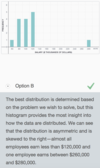
Outlier
A data point in a data set that is atypical in that it lies far outside of the range of the other points in the data set. Technically, an outlier is more than 1.5 times the interquartile range greater than the upper quartile or 1.5 times the interquartile range less than the lower quartile. For example, if the lower quartile, Q1, is 500 and the upper quartile, Q3, is 700, then the interquartile range is 700 – 500 = 200. So any observation with a value less than 200 = 500 – (200*1.5) or greater than 1,000 = 700 + (200*1.5) would be considered an outlier. See quartile.
What are the formulas for Mean, Median, & Mode in Excel?
Mean, Median, & Mode in Excel
- Mean =AVERAGE (Then drag and select all points- EX: A1:A5 OR you could manually enter all the #’s with a comma EX: 1.5, .5, 1)
- Median =MEDIAN (Then drag and select all points)
- Mode =MODE.SNGL (Then drag and select all points)
- *EXTRA: The Excel function MODE.MULT finds all of the modes in a data set, generating a vertical array that has one row for each mode in the data set. Suppose a data set has three modes. To find them, instead of entering the MODE.MULT formula in a single cell, highlight at least three vertically-contiguous cells and then input =MODE.MULT(number 1, [number 2], …) into the formula bar. Then, instead of using ENTER to find the result, use CTRL+SHIFT+ENTER to enter the array. The modes will appear in the first rows of the array (filling as many rows as there are modes in the data set) and #N/A will appear in each of the other rows in the array.*
- How do we know how many vertically-contiguous cells to highlight when using this function? To determine how many modes are in a data set, enter =COUNT(MODE.MULT(number 1, [number 2], …)) in a single cell. When you click ENTER, the function will return the number of modes in the data set. The result will tell you how many vertical cells you should highlight to create a MODE.MULT array.*
- Note that our embedded spreadsheet currently does not support the functionality required by MODE.MULT.*


us & china

What is a conditional mean and what is the excel formula?
A conditional mean is the mean (average) of a subset of data. We apply a condition and calculate the mean for values that meet that condition. For example, in a data set that contains data on both males and females, a conditional mean might be the mean of the data pertaining to only the females in the data set.
Calculate Conditional Mean in Excel
- Conditional Mean =AVERAGEIF(range, criteria, [average_range])
- Range- the options we’re choosing our condition from- but ALL of the options
- Criteria- the specifics of what we’re looking for, the “condition”
- Average Range- all the data from the set we want to average (it will only take the ones you want because we’ve told it to!
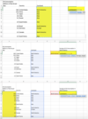
- It will end up looking up something like this =AVERAGEIF(C2:C11,E2,A2:A11)
- Commas between each category
PERCENTILE- What is it and what’s the excel formula?
The value of a variable for which a certain percentage of the data set falls below. For example, if 87% of students taking the GMAT exam earn scores below 670, the 87th percentile for the GMAT exam is 670 points.
To find a percentile in Excel, we use the following function:
- =PERCENTILE.INC(array, k)
- Array is the range of data for which we want to calculate a given percentile.
- K is the percentile value.
- For example, if we want to know the 95th percentile, k would be 0.95.*

What percentile does the mean represent?
What percentile does the median represent?
What percentile does the mode represent?
The answer cannot be determined without further information
- Remember that the mean’s location depends upon the distribution of the data set. Recall how the location of the mean differs for a symmetrical distribution and a skewed distribution. Therefore, there is no way to determine the percentile of the mean without more information about the data set.
50%
- Remember that half of a distribution’s data points are less than or equal to the median. Therefore, the median is equal to the 50th percentile, because 50% of the data points are equal to or below this value.
The answer cannot be determined without further information
- Remember that the mode’s location depends upon the distribution of the data set. Therefore, there is no way to determine the percentile of the mode without more information about the data set.
Variance - What is it and what’s the excel formula?
The variance measures how far each point is from the mean.
A measure of the spread of a data set’s values around its mean value.
-
If the true population mean is known:
the variance = the sum of the squares of the differences between each point of the data set and the population mean / (total number of data points) -
If the mean is estimated from a sample:
the variance = the sum of the squares of the differences between each point of the data set and the sample mean, / (total number of data points in the sample - 1) - The variance is the square of the standard deviation.
- The variance is measured in squared units (e.g., if the data set contains data denominated in dollars, the variance will be in squared dollars).
Variance in Excel
- number 1 is the first number, cell reference, or range of cells for which to calculate the specified value.
- =VAR.S(number 1, [number 2], …)
- [number 2],… represents additional numbers, cell references, or ranges of cells. The square brackets indicate that the argument is optional.
Standard Deviation in Excel
- =STDEV.S(number 1, [number 2], …)
- number 1 is the first number, cell reference, or range of cells for which to calculate the specified value.
- [number 2],… represents additional numbers, cell references, or ranges of cells. The square brackets indicate that the argument is optional.
****** “.S” - that’s listed above after both things - means we are working with a sample
*OPTION- We can also find the standard deviation using the Excel function =SQRT(number) to take the square root of the variance. For example, =SQRT(16)=4.


10
The range is the difference between the maximum value and the minimum value. We can see from the histogram that the maximum value in this data set is 10 and the minimum value is 0, so the range equals 10–0=10.


If the variance of a data set is 9, what is the standard deviation?
3
The standard deviation is equal to the square root of the variance. If the variance is 9, then the standard deviation must be 3.
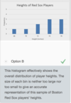
Calculate the mean and the standard deviation for the heights of the ten Boston Red Sox players.


Define & state how to create descriptive statistics in excel.
Also known as summary statistics, these are numbers that provide a quick overview of the properties of a data set. Typically, descriptive statistics include the data set’s mean, median, mode, standard deviation, sample size, minimum, maximum, and range.
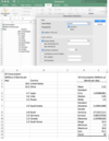
Descriptive Statistics in Excel! (This makes a table with Mean, Median, Mode, Standard Deviation, etc…)
- Data -> Data Analysis -> Descriptive Statistics
- Input Range (Put in all the boxes of data that you want to use- and included the label! Most likely, they’ll be in one column. For example A1:A11, which means A1 through A11)
- Click LABEL IN FIRST ROW BOX
- Input Range (Put in all the boxes of data that you want to use- and included the label! Most likely, they’ll be in one column. For example A1:A11, which means A1 through A11)
- Output Range (Where you want the left corner of the box to be)
- Select/Check SUMMARY STATISTICS so the table is made.
kurtosis
A measure of the flatness or sharpness of a distribution. A flat distribution with thick tails has a low or negative kurtosis; a very sharp distribution, with thin tails and a sharp rise to the peak, has a large, positive kurtosis.
Coefficient of Variation
- The standard deviation describes how much the values in a single data set vary, but what if we want to compare the amount of variation in two different data sets?
- Coefficient of Variation is a measure of a data set’s variability relative to its mean. The coefficient of variation (CV) is particularly helpful when comparing the variability of two data sets with different means. Calculated as the standard deviation divided by the mean, the CV is typically expressed as a percentage. For example the CV of a data set with mean = 100 hours and standard deviation = 15 hours is 15 hours/100 hours = 15%.

Let’s use the coefficient of variation to compare a few data sets. Which of the following data sets has the highest relative variation?
- Mean=7.00; Standard Deviation=1.64
- Mean=82.76; Standard Deviation=189.53
- Mean=150.82; Standard Deviation=201.15
- Mean=172.00; Standard Deviation=25.54
Mean=82.76; Standard Deviation=189.53
- Remember that coefficient of variation=Standard DeviationMeancoefficient of variation=Standard DeviationMean. We could formally compute the value: CV=189.5382.76=2.29CV=189.5382.76=2.29, or we could do a rough estimate of the CV for this option by comparing the numerator and denominator. Since the standard deviation is more than twice the mean, this option has a CV greater than two.
