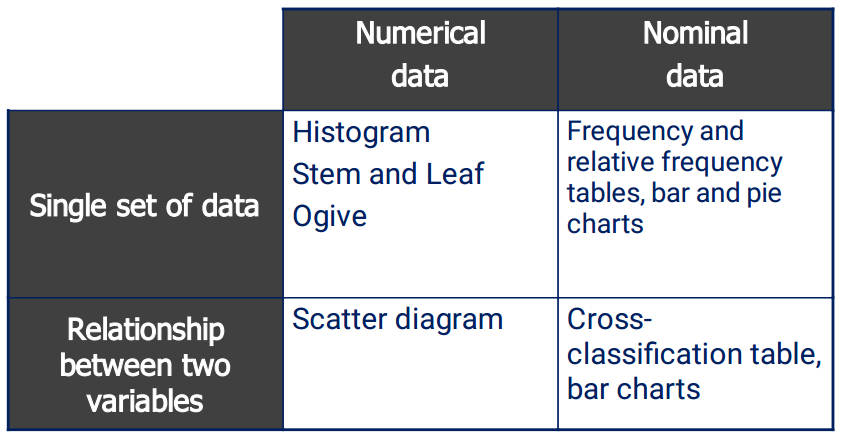
Graphical methods that are used when the data are numerical.
The histogram is not only a powerful graphical technique used to summarise numerical data, but it is also used to help explain probabilities.
Building a Histogram
- *1)** Collect the data
- *2)** Create a frequency distribution for the data… How?
- *a/** Sturges’ formula: Number of class intervals
K = 1 + 3.3log(n) or 2k >= n (internet).
Exp: A survey of 200 new residential subscribers.
K = 1 + 3.3log(200) = ~ 9
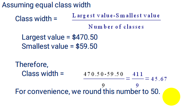
- *b/** Class width
- It’s best to use equal class widths but sometimes we use unequal class widths when several classes are combined together to form a wider and ‘more populated’ class.
3/ Construct the frequency distribution and draw the graph.
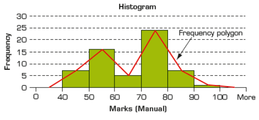
A frequency polygon
A frequency polygon is obtained by plotting the frequency of each class above the midpoint of that class and then joining the points with a straight line.
Shapes of Histograms
1/ Symmetry
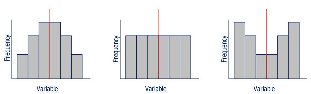
A histogram is said to be symmetric if, when we draw a vertical line down the center of the histogram, the two sides are identical in shape and size.
Shapes of Histogram
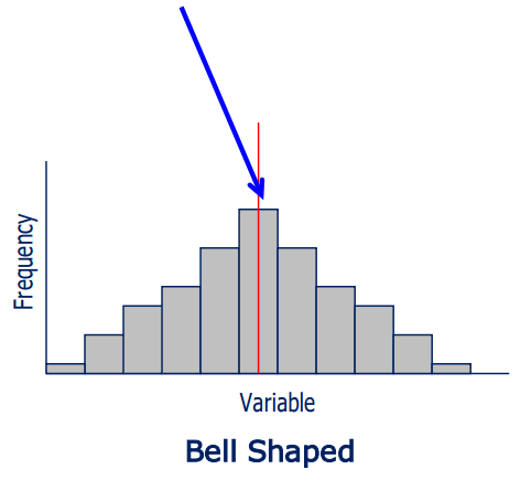
2/ Bell Shape
A special type of symmetric unimodal histogram is one that is bell shaped.
Many statistical techniques require that the distribution of the population be bell-shaped.
Drawing the histogram helps verify the shape of the population distribution in question.
Shapes of Histograms
3/ Skewness
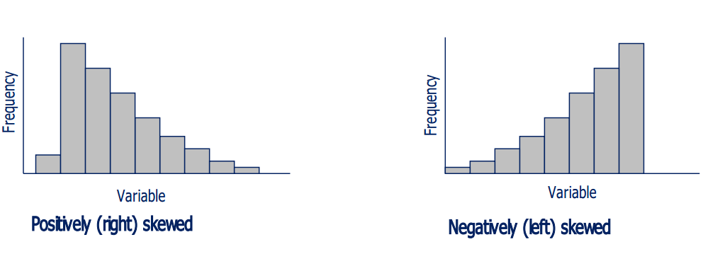
A skewed histogram is one with a long tail extending either to the right or to the left.
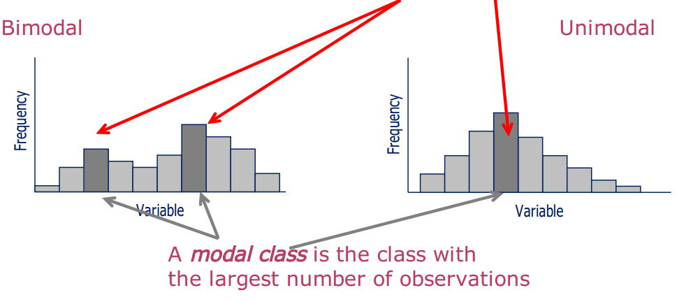
Modality
Shapes of Histogram
A unimodal histogram: a single peak
A bimodal histogram: two peaks.
Comparison of Histograms
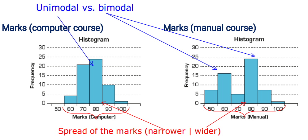
The marks from the computer-based statistics course and the manual statistics course have very different histograms.
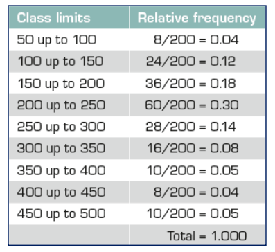
Relative frequency

It is often preferable to show the relative frequency (proportion) of observations falling into each class, rather than the absolute frequency itself.
Relative frequencies should be used when comparing
two or more histograms, each with different numbers of
observations.
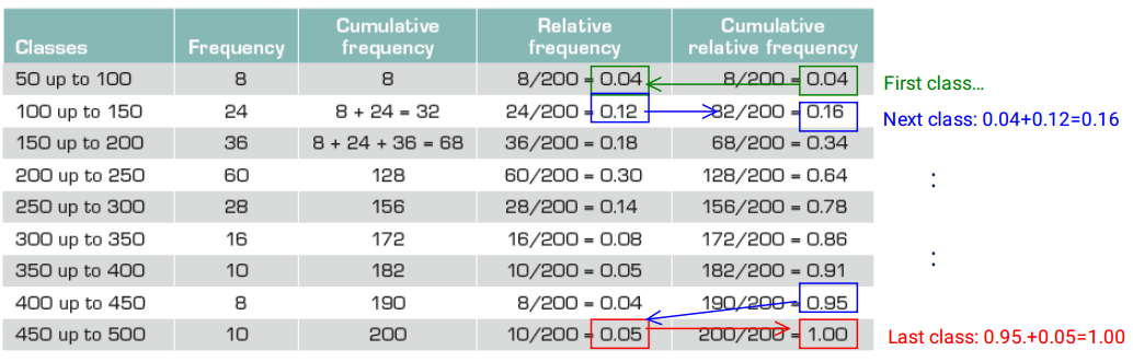
Ogive is a graph of a cumulative relative frequency distribution.
1/ Calculate relative frequencies.
Calculate cumulative relative frequencies by summing thecurrent and all previous relative frequencies. (For the first class, its cumulative relative frequency is just its relative frequency.)
2/ Graph the cumulative relative frequencies.
What can we do with ogive?
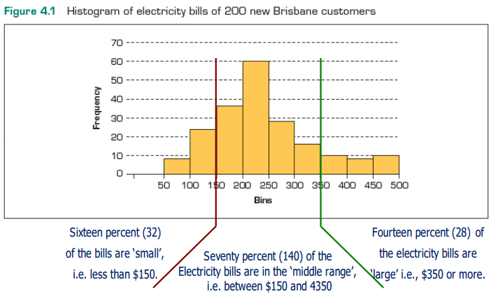
1/ What electricity bill value is at the 50th percentile?
We can estimate the electricity bill value that is at the 50th percentile as approximately $224.
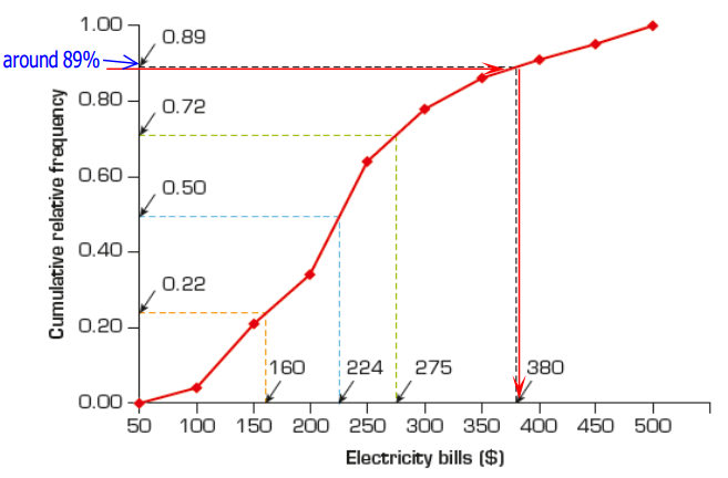
2/ What proportion of the electricity bills are less than $380?
We estimate the proportion of electricity bills that are:
- Less than $380 is 89%
- Greater than $380 is 11%
- Less than $275 is 72%
- Less than $160 is 22%
- Less than $224 is 50%

Time-series data
Cross-sectional data
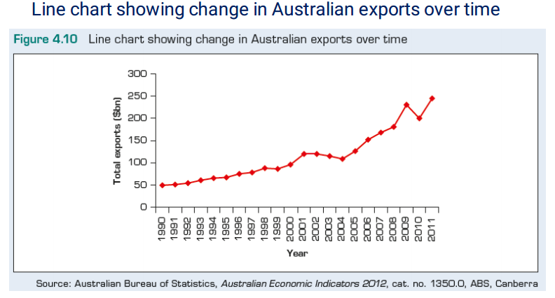
Time-series data: Observations measured at successive points in time on a single unit.
[Cross-sectional data: Observations measured at the same point in time].
Time-series data are graphed on a line chart, which is called a time-series chart.
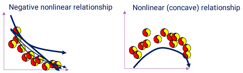
Scatter diagram
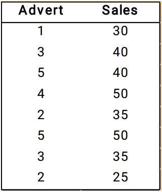
Exp: A small-business owner wants to assess the effects of advertising on sales levels.
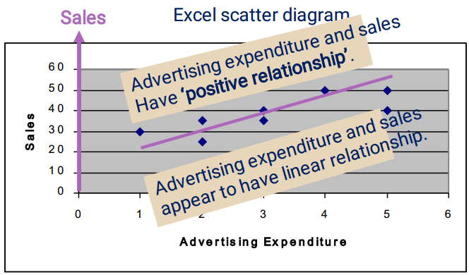
A scatter diagram can describe the relationship between two numerical variables.
In this case: Advertising expenditure and Sales.
Patterns of Scatter Diagrams
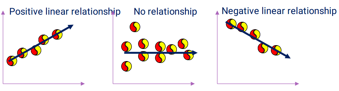
Linearity and direction are two concepts we are interested in.
Summary I
Summary II