Design Principles Flashcards
What are design principles?
General “rules of thumb” that describe features of “usable” systems
Guidelines concerning what to include and what not to include in an interface
General “rules of thumb” that describe features of “usable” systems
Guidelines concerning what to include and what not to include in an interface
Comes from:
- Theory
- Research
- Practice
They represent knowledge derived and sythesized from the above sources
What are design principles useful for?
Informing design
- Help designers to think critically about their systems
- Guide designers toward approaches (e.g., layout, structure, emphasis, etc) have been shown to work or have strong theoretical support
Evaluating solutions
- Used later in heuristic evaluation and referred to then as usability principles
- Conudcted by experts(user involvement not required)
- Very effective at catching certain design flaws early in design process
What are the design principle names?
- Visibility
- Constraints
- Feedback
- Mapping
- Consistency
- Affordance
- Simplicity
- Matching
- Minimize memory load
- Diagnose/recover from errors
- Control and freedom
- Flexibility
- Provide help
What is design principle: Visibility?
- Make core user functions clearly apparent(e.g., toolbars vs. Menus)
- Hide secondary user functions
- Visible properties guide users as to what to do next
- Structure enhances visibility
Examples:
think about MS word’s top menu bar
or the attached image

What is the design principle: Constraints?
Constraints
Restrict the kinds of user actions that can take place for any given mode of interaction
Provide people with a range of usage possibilities
If hard constraints don’t make sense, try to at least guide user
Example:
Forms with limited domains/dropdowns/options

What is the design principle: Feedback
Continuously inform the user about what the system is doing
How the system is interpreting the user’s input
User should at all times be aware of what is going on
Feedback should be as specific as possible based on user input, ideally provided in the context of the user’s action.
With longer jobs, the more detail you can provide on the status, the better

Design Principle: Feedback
Lack of feedback relates directly to one of Don Norman’s gulfs
Which one is it and why?
Gulf of evaluation:
- User does not receive enough information from the system to construct a proper mental model
- User has trouble interpreting system output in light of his/her goals
For feedback, how do user perceive delays in response time?
Response time
- How users perceive delays
- 0.1 second max: perceived as “instantaneous”
- 1 second max: user’s flow of thought stays uninterrupted, but delay noticed
- 10 seconds: limit for keeping user’s attention focused on the dialog
- > 10 seconds: user will want to perform other tasks while waiting, i.e. get a cup of coffee
Feedback during long delays can be:
- Cursors (short transactions)
- Percent done dialogs
- Other parts of the interface should continue working (if possible) as the long task completes
- Should be possible to pause/cancel long jobs
How does the design principle feedback relate to “good” or high bandwidth connectivity?
Not everyone has fast/reliable internet (know the user)
Types of delays:
- Accessing a backend database
- Downloading large content
Length downloads change users’ perception of the quality of the content
design principle: feedback
What are some strategies for dealing with connectivity-related delays?
Providing appropriate feedback
- E.g., Where, what, quantity of data, estimated time remaining
Ensuring that the content that downloads first is meaningful
- E.g., Descriptive tops of pages, informative ALT text labels for images, selective downloading
Users may be able to get what they need without the large content
Enabling offline operations
What is the design principle of Mapping?

What is “Instrumental Interaction and what is the following:
Domain object
Instrument
Device
Two metrics from Michel Beaudouin-Lafon’s “Instrumental Interaction”
– Degree of Integration
– Degree of Compatibility
Domain Object:
- Data(object) of interest
- Text in text editor
- Shapes in a drawing program
Instrument:
- Method by which domain objects are manipulated (e.g. widget)
Device
- Input device used to manipulate the instrument (mouse)
What is degrees of freedom?
How many “dimensions” something can be manipulated in
How many degrees of freedom is:
A mouse
Rotary knob
Scroll bar
mouse?
- 2 DOF movement + 1 per button
rotary knob?
- 1 DOF (angle)
scroll bar?
- 1 – up or down
What is degree of integration
Ratio of degrees of freedom (DoF) of instrument to DoF of input device
i.e., instrument DoF / device DoF
Indicates degree to which the input devices map onto the logical part of the interface instrument
Example: Scrollbars and mouse: 1⁄2
What would the examples be for the following degree of integration:
1/2
2/2
3/2
Freedom of instrument to freedom of input device
1/2 = Scroll bar being manipulated by mouse
2/2 = Moving a 2d shape on the screen (folder on desktop) with mouse
3/2 = A 3d object with a mouse
What does it mean when the degree of integration ratio is >1?
This would indicate more effort required on part of user, because the input device does not naturally perform the abilities needed, an additional button press or something would need to be implemented.
What is degree of compatibility?
despite being a fairly intuitive mapping, using typical scroll bar has low degree of compatibility
Why?
Similarity between physical action and response of the object
Dragging object has high degree of compatibility What about inputting numbers to change font size?
Think of a smart phone, flicking up and down to scroll is much more natural then using the typical scroll bar.
What is the design principle of Consistency?
- Consistent language/terminology
- Consistent graphics
- Same information/controls in same location on all screens dialog boxes
- Forms, pages, etc. follow boiler plate
- Especially important for websites: helps user know they are still on the same site
- principle of least surprise (gestalt)
- similar things should act similarly
- different things should look different
- Consistent interaction
- Consistent results
- Same commands, actions will always have the same effect in equivalent situations
- Consistent results lead to predictability
- Consistent input
- Consistent syntax across complete system “Ctrl+C”/“Ctrl+V” for Copy/Paste in Windows
- Consistent results
Considering the design principle of Consistency, what is wrong with these check boxes?

The offset?
What can inconsistency lead to?
- Inconsistency can lead to
- User frustration
- Increased learning time
- Errors
- Disorientation (Web)
What is the design principle of Affordances?
Properties of an object “suggest” how the object may be interacted with
- a door panel affords pushing
- a door handle affords pulling

How would one use metaphors to suggest affordances?
- Can use metaphors to suggest affordances
- Metaphor of desktop, files, folders, trash can, etc.
- But remember affordances may not transfer from physical to digital world
- Don’t blindly mimic real-world controls

Degree of freedom and integration.
How do you click or adjust the knob with mouse and keyboard? It’s not intuitive
What is the design principle of Simplicity?
- Common tasks should be easy to perform
- E.g., minimize the number of steps
- Use the minimum amount of visual information to effectively communicate design goals
- Simplicity leads to quickly recognized and understood functionality
- Less information == less time to process
- Simplicity also promotes memorability
- Less to remember
- Minimize number of controls and graphical elements
- Include only those that are necessary
- Eliminate, or relegate others to secondary windows, etc.
- Minimize clutter
- Clutter hides important information
When possible with the design principle of simplicity, what should be used whenever posssible?

Why should interfaces not contain information that is irrelevant or rarely needed?
Should not contain information which is irrelevant or rarely needed. Every extra unit of information in a dialogue competes with the relevant units of information and diminishes their relative visibility.
good-looking interfaces are enjoyable to use.
What is an approach involving the mouse to assist with simplicity?
Hover over controls.
The downside is, how does the user know that there is controls that can be hovered over?

How do expanding forms represent simplicity?
What is the downside?
expanding forms provide interaction only when it is requested
what is the downside of this approach?
How do they know it can do this?
What is the design principle of Matching?
- Match between system and real world
- Speak the user’s language
- Any terminology should be based on user’s language for the task

What are examples of usiing meaningful mnemonics, icone and abbreviations in Matching?

What is the design principle of Minimize Memory Load?
- Computers are good at remembering things, people aren’t!
- Leverage what we know about human memory. E.g.,
- Promoting recognition over recall
- Use chunking to reduce short-term memory load
What is the design principle of Diagnose/Recover from Errors?
No matter how good your design is, users will make errors. What happens when they do?
What are types of Errors users can make (Diagnose/Recover from errors)
Mistakes:
- conscious deliberations that lead to an error instead of the correct solution
- Intended action – unintended result
- e.g., pressing send to send an email, but it sends to ALL instead of ONE
Slips:
- unintended action
- e.g., pressed X when meant to maximize
- unconscious behavior that gets misdirected en route to satisfying a goal,
- e.g. drive to store, end up in the office
- shows up frequently in skilled behavior
- often arises from similarities of actions
What are the primary differences between Slips and Mistakes?
slips could be a lapse in attention, a change in routine (always clicking OK, even to “accept virus”), or difficult to use system
mistakes typically occur when a person misunderstands something
Exercise: classify these as slips or mistakes
- Mistyping an email address
- Clicking on a heading that isn’t a link
- Clicking “Save” instead of “Open”
- Slip
- Mistake
- Slip

Mistake
What is a Capture Error (Slips)?
capture error - frequently done activity takes charge instead of intended one
occurs when common and rarer actions have same initial sequence
- Telling someone your cell number when you intended to give your work number
- Clicking “OK” in a delete file dialogue box when you don’t want to delete it
- leave your house, and end up walking toward school instead of to the grocery store
What is a description error (slips)?
description error - intended action similar to others that are possible
- Usually occurs when right and wrong objects physically near each other
- pour milk into bowl instead of glass
- move file to trash instead of to folder
What is a loss of activation slip?
Loss of activation – focus or memory lapses
Forgetting what the goal is while undergoing the sequence of
actions
- start going to room and forget why you are going there navigating menus/dialogs and can’t remember what you are looking for but continue action to remember (or go back to beginning)
due to interruption
- get coat out, interrupted by phone call; then go out without coat
due to satisfied parallel goal
- walking away from ATM w/o card, got cash!
- walking away from copier without originals, got copy
What are Mode Errors (Slip)?
People do actions in one mode thinking they are in another
- refer to file that’s in a different directory
- look for commands / menu options that are not relevant Daily life in vi
What are the types of slip errors?
- Capture Error
- Description Error
- Loss of activation
- Mode errors
What are the general rules for designing for Slips and Mistakes?
- design to prevent errors from occurring: prevent slips before they occur (e.g., visible modes)
- eliminate error-prone conditions
- Detect and correct slips when they do occur
- Allow for user correction through feedback and undo
- lower demands on short-term memory!! keep procedures short
- minimize interruptions
- use forcing functions
- automatic transmission: you must hold down brake to shift out of Park
- must take card out of ATM before you get your money
How do you design for the specific slips of:
- Description Errors
- Capture Errors
description errors
- in icon-based interfaces, make sure icons are not too similar
- check for reasonable input, etc.
capture errors
- on top of confirmations, make actions undoable
- allows reconsideration of action by user
- e.g. Recycle bin can be opened and “deleted” file taken back out
preventing capture and description errors (slips)
- avoiding habitual action sequences with identical prefixes (start one command but can finish another)
- avoid actions with very similar descriptions
- keep dangerous commands away from common ones
How do you design for the specific slips of:
- Loss of activation
- Mode Errors
loss of activation
- if system knows goal, make it explicit (e.g, breadcrumbs on web, status in wizard)
- if not, allow person to see path taken
Modes: No one remembers what mode they’re in
- eliminate modes
- increase visibility of mode
- spring-loaded or temporary modes (shift on iphones)
- disjoint action sets in different modes

How do you prevent errors with confirmation dialogs?

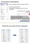
How are greying out items a good prevention technique?

What are the Generic System Responses for Errors?
Gag
- deals with errors by preventing the user from continuing
- E.g., can’t continue until correct password is entered
Warn
- warn people that an unusual situation is occurring
- when overused, becomes an irritant
Self-correct
- system guesses legal action and does it instead
- but incorrect guessing leads to trust issues
- E.g., auto capitilization
Do nothing
- illegal action just doesn’t do anything
- user must infer what happened
- enter letter into a numeric-only field (key clicks ignored) put a file icon on top of another file icon (returns it to original position)
Lets talk about it
- system initiates dialog with user to come up with solution to the problem
- compile error brings up offending line in source code
Teach me
- system asks user what the action was supposed to have meant
- action then becomes a legal one
- Learning systems
- “did you mean…”?
What are Shneiderman’s guidelines for error messages?
- Have a positive tone: avoid using terms like FATAL, INVALID, BAD
- Be specific and address the problem in the user’s terms: avoid obscure internal codes
- Put users in control: tell them what they should do to recover and continue
- Use a consistent interface and comprehensible format Audio warnings should not be embarrassing
- Provide context-sensitive help, F1
- User the User’s language!!!!!!
- restate the user’s input
- do not use “cannot open file”
- Use “cannot open file named paper.doc”
- restate the user’s input

What does it mean to show errors as early as possible?

Re-write the following common error messages using friendlier language. The message should explain the cause and suggest a method for fixing the problem. For each message imagine a context in which the problem will occur:
– SYNTAX ERROR
– INVALID FILE NAME
– INVALID DATA
There is a problem with the way you have written the command. Check for typos.
You cannot use ‘/’ or ‘?’ in a file name. Please choose another file name.
This field will only accept numeric data. Try again, checking that only numbers are used.
What is the design principle of Control and Freedom
Users don’t like to feel trapped by the computer
- Should offer an easy way out of as many situations as possible
users should be free to do what they want to do, and not restricted by the system
learning by exploring – low consequences
What are good design strategies for Control and Freedom?
Strategies:
Cancel button (for dialogues waiting for user input) Undo (can get back to previous state)
Interrupt (especially for lengthy operations)
Quit (for leaving the program at any time)
Defaults (for restoring a property sheet)
Ways to enable/disable automatic features
- e.g., auto-correct
Let users turn off “features”
- What if autocorrect or auto alignment does it wrong
- Word capitializes start of a sentance - but you often make table captions without caps
What is the design principle of flexibility?
Shortcuts: Experienced users should be able to perform frequently used operations quickly
Strategies:
- accelerators
- E.g., command completion, menu shortcuts, function keys
- navigation jumps
- e.g., going to window/location/page directly, and avoiding intermediate nodes
- type-ahead (entering input before the system is ready for it)
- history systems
- WWW: ~60% of pages are revisits
What are accelerators?
accelerators – unseen by the novice user – may often speed up the interaction for the expert user such that the system can cater to both inexperienced and experienced users. Allow users to tailor frequent actions.
If an application has a diverse user base, it is difficult (if not impossible) to design it to suit all needs
What is one solution?

What is the design principle of Provide Help
Help is not a replacement for bad design
Simple systems:
- walk up and use; minimal instructions required
Most other systems:
- Feature rich
- Some users will want to become “experts” rather than “casual” users
- Intermediate users need reminding, plus a learning path
What are the types of helps one can provide?
Manuals
Tutorials
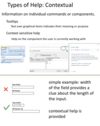
Contextual
Tips
What are manuals and who would use them?

What are tutorials and how do they work as helps?

What is contextual help?

What are tips?

Map each design guideline to Usability goals