Flexbox Flashcards
(27 cards)
What is the aim of the flexbox layout?
To provide a more efficient way to lay out, align and distribute space among items in a container, even when their size is unknown and/or dynamic (thus the word “flex”).
Is the flexbox layout direction agnostic?
Yes, the flexbox layout is direction-agnostic as opposed to the regular layouts (block which is vertically-based and inline which is horizontally-based).
What is the most appropriate layout for the components of an application and small-scale layouts, Flexbox or Grid?
Flexbox layout is most appropriate to the components of an application, and small-scale layouts, while the Grid layout is intended for larger scale layouts.
What is a “flex container”?
A parent element with flex properties.

What is a “flex item”?
A child element with flex properites

If “regular” layout is based on both block and inline flow directions, the flex layout is based on ___?
flex-flow directions
How do you define a flex container?
.container {
    display: flex; /* or inline-flex */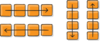
}What path will flexbox items follow in a layout?
Items will be laid out following either the main axis (from main-start to main-end) or the cross axis (from cross-start to cross-end).
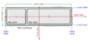
What is the main axis of a flex container?
The main axis of a flex container is the primary axis along which flex items are laid out.

Does the main axis follow a horizontal path?
It is not necessarily horizontal; it depends on the flex-direction property.
What is the cross axis?
The axis perpendicular to the main axis is called the cross axis. Its direction depends on the main axis direction.
Is display a property for the parent or the child?
Parent – This defines a flex container; inline or block depending on the given value. It enables a flex context for all its direct children.
Is order a property for the parent or the child?
Child – By default, flex items are laid out in the source order. However, the order property controls the order in which they appear in the flex container.
.item {
    order: 5; /* default is 0 */
}
Is flex-direction a property for the parent or the child?
Parent – This establishes the main-axis, thus defining the direction flex items are placed in the flex container.
.container {
    flex-direction: row | row-reverse | column | column-reverse;
}
Flexbox is (aside from optional wrapping) a _______-direction layout concept.
Single. Think of flex items as primarily laying out either in horizontal rows or vertical columns.
Is flex-grow a property for the parent or the child?
Child – This defines the ability for a flex item to grow if necessary. It accepts a unitless value that serves as a proportion.
.item {
    flex-grow: 4; /* default 0 */
}

If all items have flex-grow set to __, the remaining space in the container will be distributed equally to all children.
Set to 1.
Is flex-wrap a property for the parent or the child?
Parent – By default, flex items will all try to fit onto one line. You can change that and allow the items to wrap as needed with this property.
.container {
    flex-wrap: nowrap | wrap | wrap-reverse;
}

Is flex-shrink a property for the parent or the child?
Child – This defines the ability for a flex item to shrink if necessary.
.item {
    flex-shrink: 3; /* default 1 */
}
Is flex-flow a property for the parent or the child?
Parent – This is a shorthand for the flex-direction and flex-wrap properties, which together define the flex container’s main and cross axes. The default value is row nowrap.
.container {
    flex-flow: flex-direction; /* or flex-wrap */
}
Is flex-basis a property for the parent or the child?
Child – This defines the default size of an element before the remaining space is distributed. It can be a length (e.g. 20%, 5rem, etc.) or a keyword. The auto keyword means “look at my width or height property”.
.item {
    flex-basis: | auto; /* default auto */
}
Is justify-content a property for the parent or the child?
Parent – This defines the alignment along the main axis. It helps distribute extra free space leftover when either all the flex items on a line are inflexible, or are flexible but have reached their maximum size.
.container {
    justify-content: flex-start | flex-end | center | space-between | space-around | space-evenly | start | end | left | right ... + safe | unsafe;
}

Is flex a property for the parent or the child?
Child – This is the shorthand for flex-grow, flex-shrink and flex-basis combined. The second and third parameters (flex-shrink and flex-basis) are optional. The default is 0 1 auto, but if you set it with a single number value, it’s like 1 0.
.item {
    flex: none | [? ||]
}
Is align-self a property for the parent or the child?
Child – This allows the default alignment (or the one specified by align-items) to be overridden for individual flex items.
.item {
    align-self: auto | flex-start | flex-end | center | baseline | stretch;
}


