Exam 1 Flashcards
(43 cards)

Hall of Bulls, Lascaux Cave, France, c. 18,000-10,000 BC
- prehistoric/paleolithic
- made with different pigment (made of stone/plant and mixed with fat)
- difficult to access, meaning unclear
- only one human figure (though humans appear on other works of this time)
- sympathetic magic/depiction of hunt
- images overlap, sometimes part of the cave is used to emphasize/complete image

Bull and Animals, Lascaux Cave, 18,000-10,000 BC // Horse, Lascaux Cave, 18,000-10,000 BC
- pictograph/gram = resembles object depicted
- sense of volume and 3D thanks to blowing pigment through hollow bone
- ideograph/gram = represents an idea/concept

Horses and Hands, Pech-Merle Cave, France, 23,000-18,000 BC
- handprints sign of human existence, perhaps a signature

Hieroglyphics on relief from tomb of Rehotep, Egypt, c. 2600 BC // Book of the Dead, Egypt, 1310 BC, detail of papyrus scroll
- pictographs -> ideographs (image represents idea or concept -> logographs (letter, symbol, sign used to represent word/phrase)
- Book of the Dead included mythology, humns, religious writings
- up to 8k hieroglyphic forms used could be read L -> R, R -> L, and up and down
- scribe/priest hired to provide sumbols and writings for tombs

Hammurabi’s Code, Babylon, 1780
- written in cuneiform, stele
- leader who devised and desired to communicate to the upperclass what the laws were (reading limited, visual communication limited)
- Hammurabi on left recieving laws from the sun god

Trajan’s Column, Rome, 114
- continuous narrative, heroics of emperor Trajan (Trajan letter replaced with St. Peter as Trajan was not a religious figure, seen as sacrilege)
- majuscules: ‘uppercase,’ serifs; serifs cause by writing instruments or merely stylistic/decorative?

Licinia Amis Tombstone, c. 280, Early Chrisitan era tombstone
- use of fish (acrostic meaning Jesus Christ) associated with Chrisitianity and adopted to be kept secret as the fish wash widely used
- overlap between Christianity and Paganism (Greek vs Latin)
- dedicated to the dead, funery reference at the top

Sacrifice and Death of Lacoon, Vatican Virgil, c. 410, Late Antique/Roman era codex page
- Virgil: Roman poet, highly regarded
- variation of formal and rustic lines with square quality and fluidity
- painted on parchment
- priest who warned Trojans about accepting the horse the Greeks were offering
- left: stage 1; right: stage 2
- interfered with war, god punished him
- roman architecture referenced

Guda the Scribe, Self-portrait in a Book of Homilies, Germany, c. 1110
- parchment, colophon, Romanesque period
- holding scroll (like a thought/speech bubble), says: “a sinful woman copied and pasted this book”
- colophon: info about typograhy or who did it, production info

Eadrith the Scribe, Cross-carpet and incipit pages from St. John’s Gospel, Lindisfarne Gospel, c. 710-721
- Hiberno-Saxon/Celtic/Insular
- vellum, glossed, interlaced, lacertine
- carpet page: decorative, abstract, chaotic, symmetry vs. order, God brings order to chaos
- elements have been added over time

Eadrith the Scribe, Chir Rho page in St. Matthew’s Gospel, Lindisfarne Gosepels, c. 710-721
- Hiberno-Saxon/Insular/Celtic
- vellum, glossed, interlace, lacertine
- Chir Rho = Christ in Greek
- rabbits (symbols of fertility) hidden within
- small dots called ‘spotting’
- lacertine: images created by using animal forms

Eadwine the Scribe, Self-Portrait, Eadwine Psalter, England, c. 1160
- Romanesque period, vellum, colophon
- scribe writing Eadwine Psalter
- not modest, seated on throne-like chair
- tools used to hold down the page

Eadwine the Scribe, Scenes of the Christmas Story, English psalter, c. 1140
- Romanesque, vellum
- use of grid natural (Egyptian), links scenes
- innovative, similar to comics

Anonymous, page from Ormesby Psalter, c.1300-25
- historiated initial, Gothic period
- textura/blackletter/Gothic/Old English
- meant to be read in terms of text as well as image
- very condensed and vertical
- often seen in newspaper headlines, represents tradtion and historic past
- colored bars = change in sentence

Anonymous, final page from Moralized Bible depicting Blanche of Castille and King Louis IX, and a monk dictating to a scribe, France, c. 1230
- vellum, Gothic period
- guild with gold leaf
- moral lessons from the bible
- commissioned by the Queen for her son

Anonymous, Yolande de Soissons in prayer, page from Psalter and Book of Hours of Yolande de Soissons, France, c.1290
- Gothic period, vellum
- virgin mary; cult figure. identified with book of hours, important
- patron seen bowing before image of Mary and baby Jesus
- beginning of humanization with cat
- prayer book

Anonymous, Buxheim St., Christopher, Germany, 1423
- block print, hand colored
- presumably meant to be known for communication purposes
- end of illuminated manuscripts
- opens market and audience
- first securly dated work
- souvenir of pilgrimmage
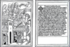
Anonymous, Ars Moriendi pages, Germany, 1466
- block book, approx 83 survived
- art of God, how-to book
- dying a good death
- dying person surrounded by demons (temptation)
- “provide for your friends, attend to your treasures” = leave will, give money to the church

Anonymous, Biblia Pauperum (Bible of the Poor) page, Netherlands, c. 1470
- block book, approx 40 pages
- not actually a bible, not for poor (couldn’t read Latin, couldn’t afford)
- biblical scenes from old and new testament, hand colored
- architectural altar piece feel, similar to “Norfolk Triptych”

Johann Gutenberg, Certificate of Indulgence, Germany, c. 1454
- moveable type; one of the first things printed
- indulgence to raise money for crusades
- paper from Italy; ink developed for clarity and consistency of letterforms
- space or name and date

Johann Gutenberg, 42-Line Bible pages, Germany, c. 1455
- first two pages actually forty lines, 180 published, 48 survived, 21 complete
- no titles or page numbers, purchaser chould have special title page made
- no cover, either, provided by purchaser

Peter Schoeffer (and Johann Fust), Mainz Psalter page, Germany, 1457
- incunabula
- devised way to print red and black ink with moveable type
- printer’s mark is one of the first, becomes important in bookmaking colophons

William Caxton, Pyes of Salibury handbill, English, 1477
- ad for his books (pyes = almanac)
- first typographic ad in England
- latin phrase at bottom says not to remove ad (the rest is in an older form of English)

Simon Master, “Tree of Jesse,” Capuchin’s Bible, France, c.1190 // Erhard Ratdolt, page from Euclid, Venice, 1482
- Tree of Jesse is Romanesque, illustrated manuscript, shows origins of geneology
- Euclid is the first printed book with geometric forms
- reflecing manuscripts to make more accepted and familiar