Charts Flashcards
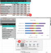
- What is the name of the feature that allows you to quickly preview your data in various ways (charts, data bars, etc.)?
- How do you invoke this feature?
- What is the best practice when previewing data in this way?
- Quick Analysis
- Select cells containing data, then use the Ctrl + Q keyboard shortcut.
Alternatively, you can hover your mouse over the Quick Analysis tooltip that appears after selecting data and click the button - then you select Bars or Charts and hover your mouse over the various options to preview the data.
- For best results, ensure that there is is a header row and header column as these will be used as the X and Y Axis labels for charts

What are two best practices when working with data that will be used in charts?
- When selecting data, do capture row and column headers as these will affect the chart labels
- When selecting data, do not capture any totals as this will skew the graph
What type of chert works best for data that uses time as a measurement?
Line Charts - specifically Line With Markers is often a good choice for reviewing time based data.
- What two types of data are best for Pie Charts?
- What is the limitation of pie charts?
- Budgets and Revenue by Business Line or Sector
- You can only show data for one row or one column; you also can’t have negative values - Pie Charts show absolute valuies
What is the mouseover icon that quickly reveals which Chart Elements can be turned on or off?
The plus + symbol
- What is the feature called where you can add trendlines, bar columns, or win/loss visuals within individual cells to show data patterns?
- How do you invoke this feature?
- Sparklines
- You select data > click on the Quick Analysis mouseover icon > go to the Sparklines tab > Select Line, Column, or Win/Loss
Alternatively, you can go to the Insertribbon tab and click onLine,Column, orWin/Lossin theSparklinesub-section > then either select yourData Range(which theSparklineswill be based on) and/orLocation Range(where you want theSparklines to appear)
- What can be added within a cell to show trends in data?
- Why is this useful?
- What was the old term for this in Excel
- Describe the steps for the simplest method to add these ‘in cell’ visuals in Excel
- Sparklines
- This is useful if you want to see trends in data without creating a full blown chart
- Select your data > hover over the Analysis icon > select Sparklines tab > select Line, Column, or Win/Loss > select the area you want the Sparklines to be added |

- What can be added the Sparklines to give you a point of reference to your data?
- When would you want to do this?
- What Sparkline type would this work especially well with?
- How do you add this?
- Axis
- If you have data that goes below zero
- Column Sparklines
- Select your Sparkline data > Sparkline (conditinal) ribbon tab > Axis button

In which ribbon tab can see which Chart Element is currently selected (or change the selected Chart Element)?
The Format ribbon tab - this will conditionally show up when you’ve clicked within a chart.

How do you toggle chart elements on and off?
The + mouseover icon quickly reveals which Chart Elements can be turned on or off

How do you reveal more granluar options for Chart Elements?
Either Double Clicking on a Chart Element or Selecting the Chart Element from the Format ribbon tab Chart Element Dropdown List will reveal more granular configuration options & controls on the Right Toolbar

Name at least six types of charts in Excel.
- Treemap
- Sunburst
- Histogram
- Pareto
- Box and Whisker
- Waterfall
- Pie chart
- Line chart
- Bar chart


